Vanessa Serradas
Elias Game Plan

The Problem
Elias Sports Bureau had spent years giving its data away through a React Native mobile app for iOS and Android. The analytics were strong, the audience was there, and none of it was paying for itself.
Ahead of the NFL season, the app had to become a paid product, with the platform modernizing in parallel to support it. Not a freemium tier, not a premium add-on: every user would now have to choose a plan. The data was good enough to charge for, but the people using it had never been asked to.
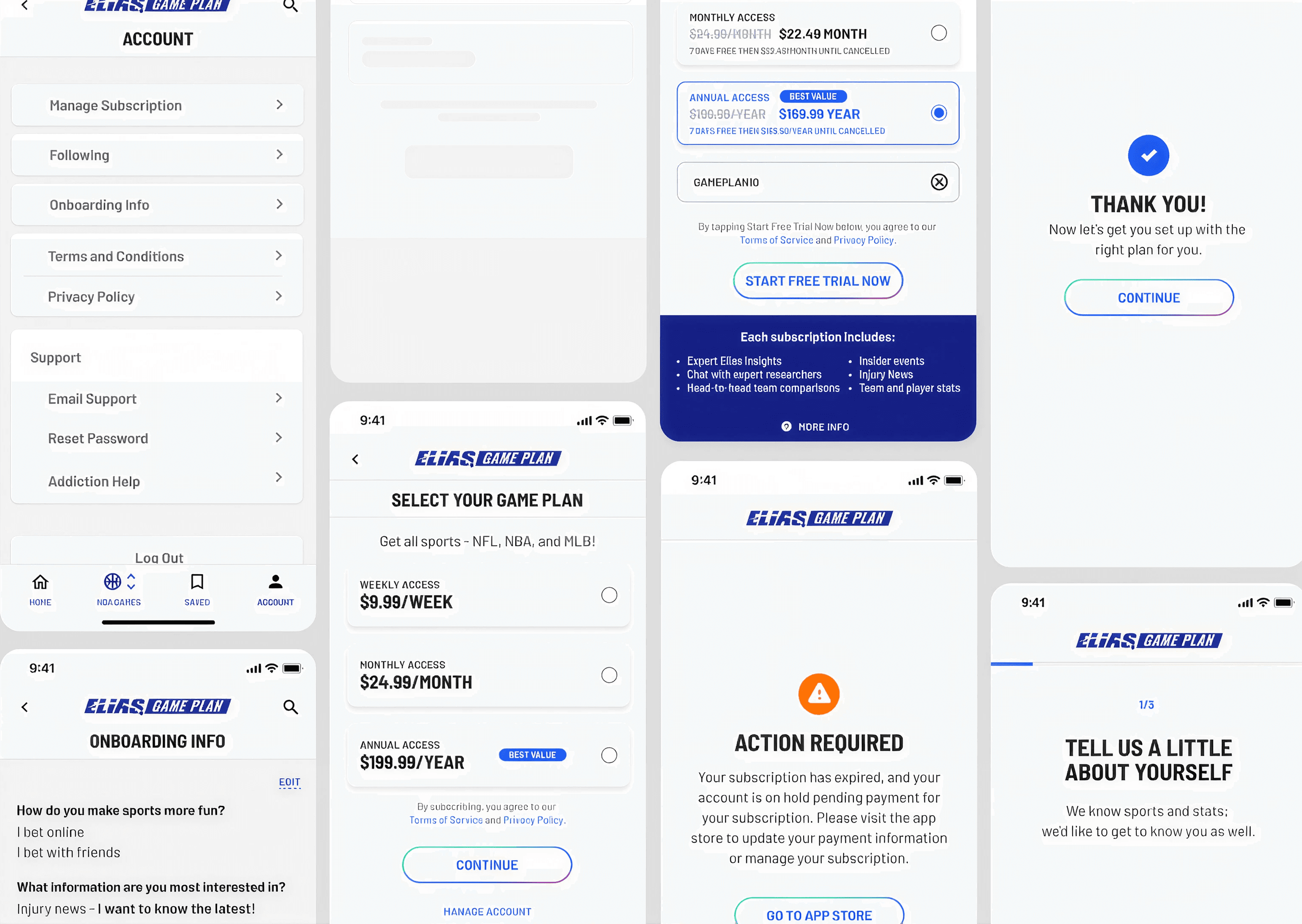
That set the design problem. A fan who had opened the app for free all season would now hit a payment screen, and the app had one chance to make the case before they left.
Process
Free trial over free tier
We looked at how competitors in the space handled the same moment. Most were converting on a trial rather than a permanent free tier, and Elias had a specific reason to follow: the data was already proven. Years of free access had shown that people used it and liked it. What it hadn't done was give anyone a reason to pay.
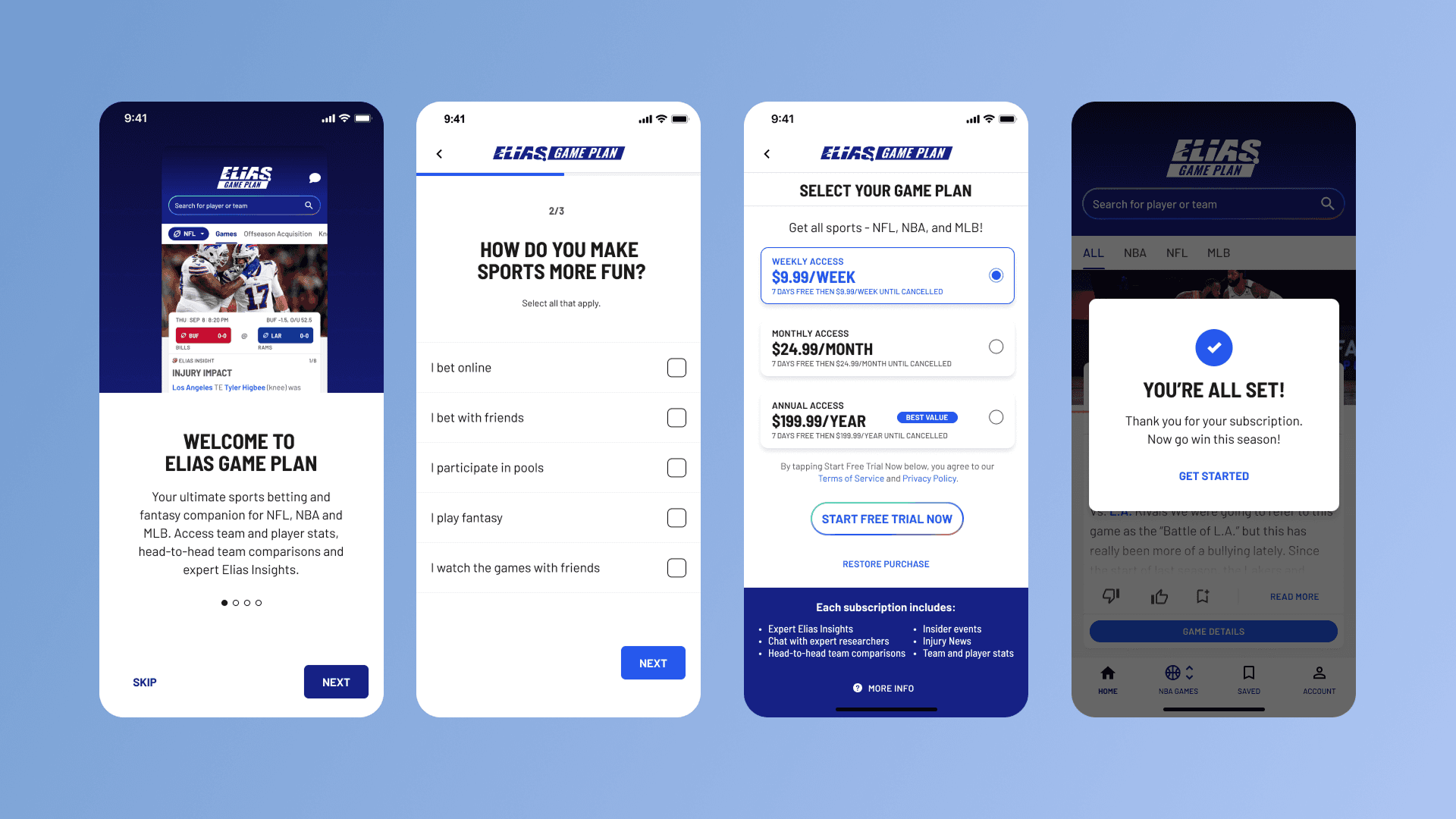
So the model became seven days free, then a plan. No feature held back, no partial access. The trial had to carry the whole argument.
Compliance shaped the plan screen
Sports betting comes with required disclosures, and the plan selection screen had to carry terms and conditions plus a breakdown of what each subscription included. That is a lot of mandatory text on the one screen where hesitation is most expensive.
I built the screen around a hierarchy instead of a wall of copy. The main features sat below the plans, where a user scanning for value would find them. Legal text moved to the footer, present and compliant but out of the decision path. A "more info" link opened the full breakdown of subscription benefits on the web, which kept the complete detail available without forcing it into the moment of choice.
The test that changed the flow
The first version put onboarding and the paywall before account creation. The thinking was to keep friction low: let people see the product before asking for anything.
Testing showed the opposite. Users dropped at the paywall, because they were being asked to commit to a product they had no stake in yet.
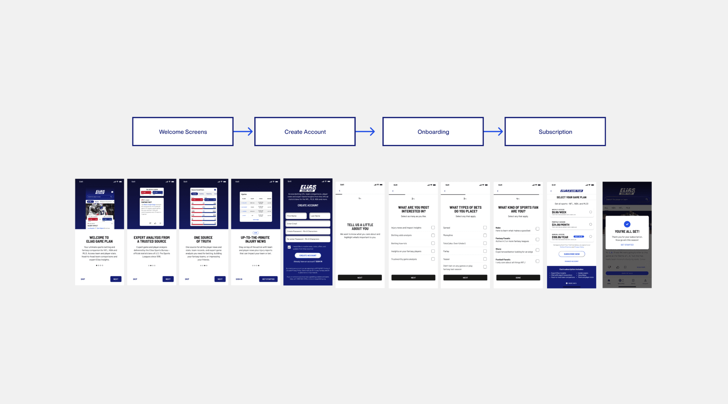
We moved account creation to the front. Once someone had made an account and answered a few onboarding questions about the teams and sports they follow, the paywall landed on a product that already looked like theirs. Returning users got the same sequence: log in, onboarding questions, then the plan screen.
Solution
Create account, then a short onboarding that captures what the user follows, then the plan screen with the seven-day trial.
The order is the design. Nothing about the paywall itself changed between versions. What changed was what the user had invested by the time they reached it, and that alone moved the drop-off.
Outcome
The first version drew over 400 users in its first 24 hours.
51.7% chose the weekly plan, which tracks with how fans engage across an NFL season: week to week, around the games they care about.